

Minute-by-Minute: Financial Markets’ Reaction to the 2020 U.S. Election
A fun little research paper I wrote with some friends a few years ago

When I was working at the Fed, I wrote this fun piece with my friends Matt and Hannah: Minute-by-Minute. We let it sit for a while and forgot about it, but Matt revived it and just posted it to his website.
We get data by the minute for prediction markets during the 2020 election, and compare it to asset prices, to create some pretty striking charts like this one:

As far as we know, this is the first research to use such fine-grained data to investigate correlations between prediction market data and asset price data. It lets us make really clear comparisons, where there’s no possibility that some other global information is affecting the stock market.
We also make the argument that there was a ‘certainty’ component to the results, where the market was not just reacting to the likelihood of a specific candidate, but reacting to the distance away from 50% likelihood.
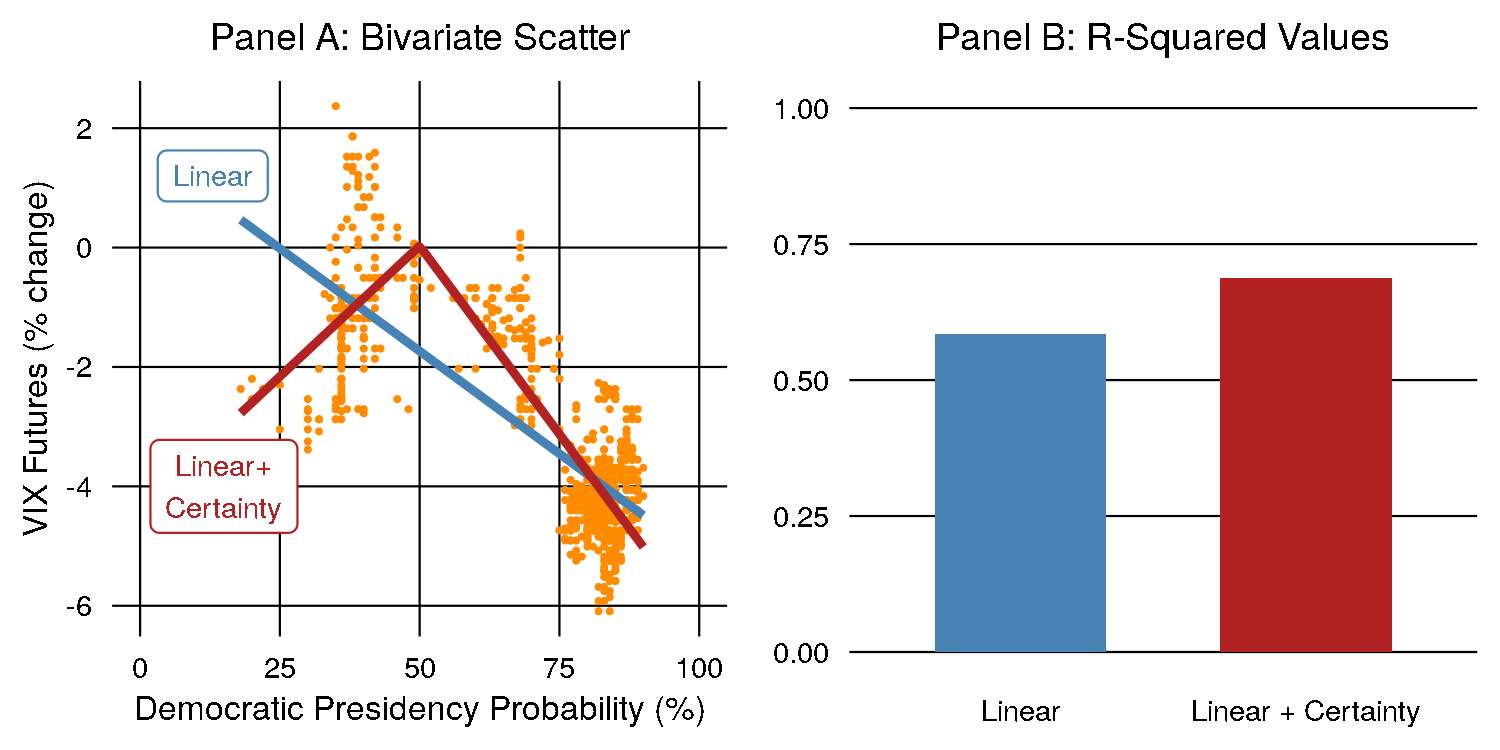
As you might expect, the VIX (a measure of volatility in markets) was highest when the election probability was closest to 50%. As the election swung further towards one side or the other, the VIX rose. A model that includes this ‘certainty’ component has a better R-squared value than just a simple linear model, indicating it does a better job of fitting the data. This is shown in the above chart.
Give it a read! It’s short and easy to understand.